
Careful With Those Axes, Eugene
(I nearly called this article 'The Axes of Evil' … but that would have been daft... )

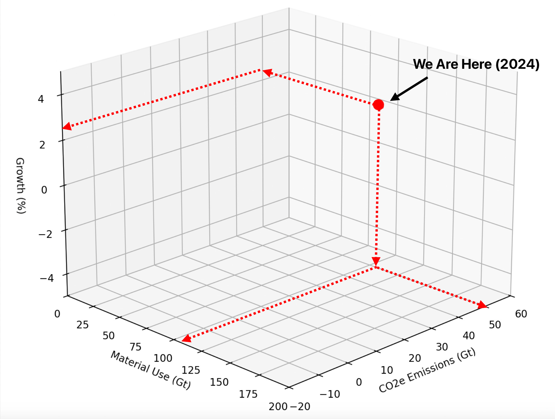
Earlier, I introduced Future Pathways, a tool I’ve been working on to help get some kind of handle on the potential trajectories of human civilization into the future. Mapping economic growth, CO2 emissions and material use on just three axes in the model sweeps an awful lot of complexity under an as yet unwoven carpet. Hopefully, the expense of losing this complexity gains us something that is useful and thought-provoking… but, as with any simplification, it has its weaknesses.
Today, we’re going to explore further why these axes were chosen, why they’re tightly correlated and what’s missing from this model—namely some “hidden variables” that might trip us up as we explore our potential future pathways, sustainable or not.
(If you want to play along at home, here’s how you can download and install Future Pathways.)
Why These Three Axes?
The choice of growth, material use and emissions as the axes for the Future Pathways model wasn’t arbitrary… but they took me a while to arrive at. Like too many, I consume an unhealthy amount of climate change research, books, documentaries, videos and podcasts. The main hope voiced in these, of a solution to the climate emergency, is an energy transition away from fossil fuels economy to a zero carbon future as fast as possible. Some tell us that the energy transition is inevitable, some that it is impossible, or it is well underway and “this is fine”, it is too late or that we are d**med. It seemed that they couldn’t all be true - perhaps some of these future predictions are more likely than others. And if so, what key characteristics - or metrics - would differentiate these directions from each other? If they are related to each other, could plotting them against each other tell us something about our direction of travel? What would it mean to be on one of those trajectories to the future?
The choice came pretty much down to this:
What are the easiest and quickest metrics to grasp that represent our current situation with respect to the climate emergency, what we’re doing about it and how might we navigate our way out of it.
In one episode of a podcast (I’m sorry, I forgot which) the conversation talked about using one of those “four quadrant” diagrams, plotting (possibly) energy consumption against material use; another talked of how energy, material use and civilization were all tightly coupled and interrelated. These sounded like some metrics that I could use. Except that plotting increased/reduced energy consumption directly wouldn’t tell us much about how sustainable our future energy use would be. Instead, I swapped out energy for carbon dioxide emissions: that is, a future with lower CO2 emissions being more sustainable (and desirable) than one with higher emissions.
NB: Before we move on, I’m going to cover the discussion about growth (degrowth or post-growth) in another post. For now, the growth axis in the visualization represents “progress”, “civilization complexity”, “happiness”, “economic growth” or “GDP” - please use whichever you are happy with, we have to plot against something!
For the model then, these metrics - growth, materials use and emissions - are not only integral to our modern civilization’s challenges but are also the dials we can choose to tweak on our course to a sustainable future. They are also pretty easy to understand:
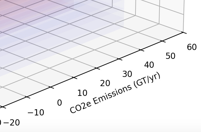
CO2e Emissions (Gt): This is a proxy for our climate impact. The burning of fossil fuels to sustain our economies and lifestyles accounts for the majority of global greenhouse gas emissions. As currently shown, the CO2e Emissions axis ranges from -20 Gt per year (significant carbon “drawdown”) to +60 Gt per year (significant increase):
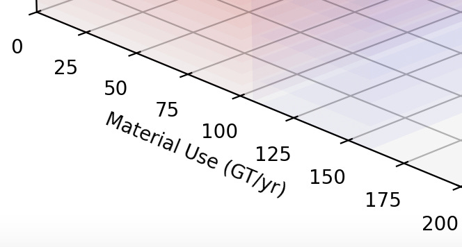
Material Use (Gt): This represents the physical throughput of civilization—the extraction, transformation, and consumption of natural resources to meet human needs… which also generates significant carbon emissions while doing so. As currently shown, the Material Use axis ranges from 0 Gt per year (we don’t extract “negative” materials!) to +200 Gt per year (significant extraction). As of 2024 we are consuming ~106 Gt per year, with predictions expecting this to rise to ~160 Gt per year by 2050:
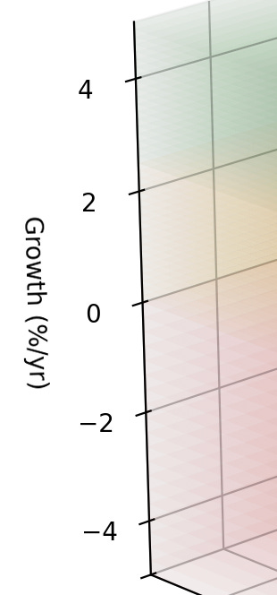
Economic Growth (% ): Often viewed as the primary indicator of societal progress, economic growth drives our ability to invest in health, education, infrastructure (stuff) and technology. But it also drives, and is coupled to, our consumption of resources and energy. As currently shown, the Growth axis ranges from -5% (significant contraction) to +5% (significant expansion):
These three variables capture the essence of the sustainability challenge: how do we maintain or improve human (and non-human) well-being while reducing environmental impact?
Edit: To be extra clear, as of end of 2024, we are currently at:
Growth: ~2.5%
Materials Use: ~106Gt
CO2e Emissions: ~50Gt
Why Are They So Tightly Correlated?
The correlation between these axes is not coincidental. Under our current economic model, without increased material consumption, civilization cannot grow, but a growing civilization generates more carbon emissions which in turn increases its demand for yet more materials and more emissions… and so on.
Professor Tim Garrett and Nate Hagens have pointed out, economic growth is fundamentally linked to energy and material throughput. Civilization behaves as an open thermodynamic system, where GDP is proportional to energy consumption over time. Hagens, for example, emphasises how economic and ecological systems are deeply intertwined— as mentioned above, more growth typically means more resource extraction and energy use, which in turn drives emissions.
Tim Garrett, in collaboration with Professor Steve Keen, has further explored these connections. Their work highlights the thermodynamic constraints on growth, illustrating how increases in economic activity require proportional increases in energy consumption. Which for a fossil-fueled economy means increased CO2 emissions. For a more detailed exploration of their research, see "The Thermodynamics of Economic Growth" (Garrett, Grasselli, & Keen, 2019). This emphasises that without decarbonisation or systemic shifts, emissions cannot be reduced without impacting global wealth.
Historically, GDP growth has been accompanied by increases in material and energy consumption, as well as CO2 emissions. Even as technology improves efficiency, the scale of economic activity tends to outpace these gains, a phenomenon captured by the Jevons Paradox: higher efficiency leads to greater total resource use. (The Jevons Paradox deserves a whole post of its own but for now I’ll post some links below.)
The Problems with Simplification
Appropriately enough, a recent video from the ever excellent The Great Simplification podcast addressed just the kind of things missing from the Future Pathways visualization, While the three axes are useful, they omit several crucial dimensions of the sustainability puzzle. Here are four hidden variables that the model doesn’t make obvious, which
talks about in his video:Debt: The global economy is burdened by an overhang of debt, which drives short-term decisions favouring growth at any cost. Debt can amplify resource overuse and delay necessary transitions.
Geopolitics: Resource scarcity, particularly in energy and critical minerals, creates competition between nations. This competition complicates global cooperation and can lead to conflict, further destabilising pathways to sustainability.
Civilization Complexity: Modern societies are highly complex, with globalised supply chains dependent on cheap energy, liquid fuels, and credit. This complexity makes transitions slower and increases vulnerability to systemic shocks.
Social Contract and Inequality: Societies have historically operated under the assumption of perpetual growth to “lift all boats.” As growth slows or reverses, the social contract is strained. Misunderstandings of biophysical limits can lead to blame, political polarisation, and unrest.
These hidden variables are interwoven with the three axes and represent significant barriers to transitioning to sustainable pathways. Ignoring them risks painting an overly optimistic or naive picture of our future. (And we haven’t even touched on incorporating alternative forms of economics, politics or societal organisation; too many rabbit holes, too little time…)
Why Use This Model Anyway?
Despite its limitations, the Future Pathways remains a mental model for exploring trade-offs and imagining futures. However, as mentioned, it’s important to note that the model does not directly indicate the effects biodiversity, extinction, or habitat loss, as these are additional layers of complexity entwined within each of the three axes. What I hope is that Its strength lies in its ability to simplify while revealing some critical dynamics:
It encourages discussion about scenarios: What happens to emissions and material use in a high-growth scenario? How does degrowth affect well-being and planetary health?
It provides an entry point for considering more complex systems. Once the basic trade-offs are understood, we can layer in variables like debt, geopolitics, and social dynamics.
It bridges philosophical divides: whether you favour eco-modernism, degrowth, or a third way, the model offers a shared language for dialogue.
Give me six hours to chop down a tree and I will spend the first four sharpening the axe.
- Abraham Lincoln
While Future Pathways provides a lens to explore the critical dynamics shaping our future, we must be cautious not to let its simplicity blind us to the complexities that lie beneath. The hidden variables of debt, geopolitics, complexity, and inequality are just as important as the axes themselves. Addressing these challenges will require courage, creativity, and collaboration.
So, what additional "axes of evil" (there, I did it!) would you consider essential to understanding our future? Let’s start a conversation. Future articles could explore biodiversity and ecosystem dynamics as potential additional axes to help us understand their interconnections further. It would be neat to extend the model to allow custom selections of axes to plot against each other… hmmmm, perhaps we need a dashboard app… 🤔
Refs:
Garrett, T. J., Grasselli, M., & Keen, S. (2019). Thermodynamics of Economic Growth. https://arxiv.org/pdf/2006.03718
Links:
Jevons paradox https://en.wikipedia.org/wiki/Jevons_paradox
Jevons paradox, the rebound effect, and the backfire effect are crucial for understanding technology
The Thermodynamics of Degrowth | Tim Garrett

The Thermodynamics of Collapse | Tim Garrett Planet: Critical
Global Resources Outlook 2023 https://www.eea.europa.eu/en/about/who-we-are/projects-and-cooperation-agreements/global-resources-outlook-2023
The Global Carbon Budget https://globalcarbonbudget.org/carbonbudget2023/
Careful With That Axe, Eugene | Pink Floyd https://music.youtube.com/watch?v=LtJc2QbM_pQ&si=_7ZyzPG4TtQpo0f6